Crash and Burn: A Grunge Display Typeface That Commands Attention
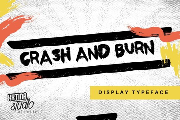
I was deep in the final round of a boutique coaching site redesign—hero section locked in, image banner ready—when I paused. The headline felt polite. Safe. Almost forgettable. So I swapped in Crash and Burn. Instantly, the space crackled. Not with noise, but with intention. That’s the first thing you notice: this isn’t just another all-caps font. It’s a display typeface with texture, weight, and attitude—like ink pressed through burlap, then scanned with care.
What Makes Crash and Burn Stand Out on Screen
Crash and Burn lives firmly in the display font category—and it knows its role. Every uppercase letter carries subtle distress: uneven edges, grainy fills, slight irregularities in stroke contrast. There are no lowercase letters, no italics, no light or bold weights—just one confident, cohesive style built for impact. It includes extended glyphs (think alternate A’s, decorative ampersands, and stylized numerals), which add flexibility without sacrificing cohesion. As a web designer, I appreciate that those alternates aren’t gimmicks—they’re design tools. I used an alternate “R” in a CTA button label (“RESERVE YOUR SPOT”) and watched how it anchored the visual rhythm without overwhelming the layout.
How It Performs in Real Web Layouts
I tested Crash and Burn across three key areas: hero headers, section dividers, and branded graphic accents. On desktop, it shines at 48–72px—bold enough to dominate but legible enough to scan quickly. On mobile? I scaled it down to 36px with generous letter-spacing (0.05em) and kept background contrast high. It held up beautifully over a muted gradient overlay—not too busy, not too quiet. One surprise: it worked exceptionally well as a short, centered tagline beneath a logo lockup on a portfolio homepage. Just three words—“BOLD. HONEST. REAL.”—and suddenly the whole brand voice clicked.
Where it truly earned its keep was in campaign landing pages. For a limited-time workshop launch, I paired Crash and Burn with Inter (a clean, highly readable sans serif) for body copy and buttons. The contrast did heavy lifting: Crash and Burn set the tone; Inter carried the message. No cognitive load, no visual competition—just clear hierarchy and emotional resonance.
Readability & Responsiveness: What Works (and What Doesn’t)
Let’s be direct: Crash and Burn is not for body text. Not for navigation menus. Not for form labels or error messages. Its charm is in its controlled chaos—and that chaos dissolves below ~24px or in tight containers. I tested it in a sticky header on scroll: at 20px, the texture blurred into noise. At 28px with extra tracking? Still hard to parse quickly. So I reserve it for moments where attention is the goal—not utility.
It also demands thoughtful background pairing. On pure white, it can feel stark. Over soft photography, it gains warmth—but only if the image has enough negative space or tonal contrast. I avoided placing it directly over busy patterns or low-contrast textures. Instead, I added subtle semi-transparent overlays (10–15% black) behind the text block when needed. And yes—I always checked color contrast ratios. At its default weight and size, it meets WCAG AA for large text against light or dark backgrounds—but never assume. Test.
Pairing, Licensing, and Practical Integration
Font pairing is where Crash and Burn becomes even more powerful. Its grunge energy balances beautifully with minimalist sans serifs (like Inter, Poppins, or Manrope) and even restrained serifs (such as Literata or Cormorant Garamond) for editorial-style sites. I wouldn’t pair it with another distressed or handwritten font—that’s visual overload. And while it’s not a script, its character gives it expressive range, especially when used sparingly: a single word in a testimonial sidebar, a chapter title in a digital course outline, or a hover effect on a “Learn More” link (with smooth scale transition, not jitter).
Before deploying, I confirmed the license covered commercial web use—including client projects and SaaS platforms. The package included WOFF2 files (ideal for fast loading), CSS snippets, and clear guidance on embedding via @font-face. No SVG hacks required. No fallback drama—just reliable rendering across Chrome, Safari, and Firefox. Bonus: multilingual support covers basic Latin Extended-A, so names with accents (José, naïve, résumé) render cleanly—critical for inclusive, global-facing sites.
When to Reach for Crash and Burn—And When to Pause
Reach for Crash and Burn when you need to signal authenticity, creative courage, or unfiltered energy. It fits naturally on a photographer’s portfolio banner, a ceramicist’s shop announcement, a mental wellness coach’s “New Group Program” headline, or a digital product’s limited-edition launch. It says, “This matters. This is different.”
Pause before using it for anything requiring speed, precision, or neutrality: pricing tables, FAQ accordions, dashboard metrics, legal footers, or multi-step forms. Its strength is emotional punctuation—not functional typography. Used thoughtfully, it elevates your brand’s digital presence without shouting. Used carelessly, it distracts.
In the end, Crash and Burn isn’t about rebellion for rebellion’s sake. It’s about clarity through contrast. It’s the visual equivalent of a well-placed pause in a spoken sentence—brief, intentional, impossible to ignore. And in a web landscape full of safe, scalable sameness, that kind of intentionality is rare. And valuable.